“I have seen an original 1611 King James Version. I cannot read it. It looks like a foreign language.”
These and similar words roll off the tongues of otherwise intelligent people who do not appreciate and often even oppose the use of the King James Bible. If you claim some measure of scholarship and cannot read it, I am afraid of you. I’m no genius, but I can read the 1611 King James Bible. I use it in research, and have read it once from Genesis to Revelation. If a so-called Bible teacher is not educated enough to read a 1611 KJV, then he is not educated enough to lecture folks about texts and translations of the Bible.
However, there are sincere folks who might want to read the 1611 King James Bible, but struggle with the typography, spelling, etc. It has some variations from modern English printing that may initially be off-putting. Understanding these variations before beginning will remove some of the difficulties. Perseverance will remove many of the rest. Below I will give some visual samples from (as well as links to) pages of a 1611 Bible printed by the Kings printer, Robert Barker.
1611 Bible typeface
A typeface is a particular set of characters (alphabet, numerals, punctuation, etc.) that share a common design. In modern times, we often think in terms of “font.” Font is a specific size and style of a particular typeface. In Microsoft Word, Old English Text MT will produce a typeface similar to the typeface used in the 1611 translation.)
The 1611 Robert Barker printing of the new Bible translation uses three different types. The Bible translation itself is blackletter typeface. Blackletter is sometimes referred to as Gothic script or Old English, but it is not a typeface limited to English. It was common in the western European countries, and remained the popular typeface in Germany, Norway, and Sweden long after it had gone out of style in England and the United States.
Roman type
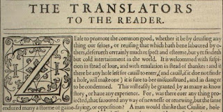
The dedication, preface, chapter headings, summaries, genealogies, etc. are in roman type (and some italic), providing an intriguing visual distinction between the text of the Bible and its related materials. The first letter in each chapter is a very large roman letter. Illustration 1 shows large and small roman type used in the preface, “The Translators to the Reader.”
Blackletter type
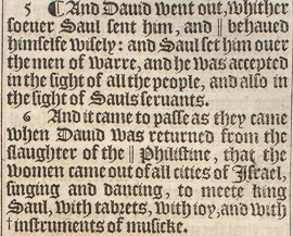
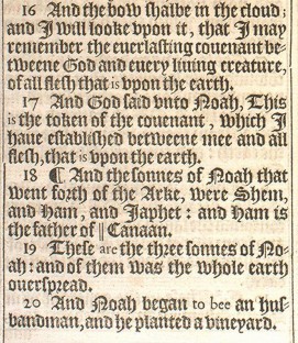
The text of the 1611 Bible is printed in blackletter type, and added target language words are in smaller roman type. These represent words that were added by the translators to more understandably translate from the source languages (Hebrew, Aramaic, Greek) into the target language (English). For examples, see the word “and” in Illustration 4, as well as “are” and “to bee” in Illustration 7. (When printers began to set the King James Bible in roman type instead of blackletter, italics were used to distinguish the added words, as appears in our modern printings of the KJV.) This was explained by Samuel Ward to the Synod of Dort, thusly:
“Sixthly, that words which it was anywhere necessary to insert into the text to complete the meaning were to be distinguished by another type, small roman.” Reported by translator Samuel Ward to the 1618 Synod of Dort
Illustration 2 shows the blackletter type in the first part of John 19:19, followed by small roman type. The superscription placed over the crucified Messiah is furnished in roman type and in all caps (Matthew 27:37; Mark 15:26; Luke 23:38; John 19:19). See Illustration 2. Notice also in the John 19 example above, that when “U” is capitalized, even within a word, it appears in the “V” style. These (u & v) are not two distinct letters in this Early Modern English blackletter typeface of the King James Bible.
Small roman type is used in the New Testament at least twice to designate a phrase found in the Greek text from the Syriac (or Aramaic) language: Eli, Eli, lama sabachthani (Matthew 27:46, but not in Mark 15:34), and Talitha cumi (Mark 5:41).
Italic type
Various places in the explanatory materials use italic type, including the introductions, as well as in the marginal references to more literal translations, and the alternate readings.
1611 Bible alphabet
The letter i
There is no “J” or “j” in the 1611 English Bible, only an “I” or “i”. The capital “I” looks much like the later capital “J”. That is a stylistic flourish, however, rather than a different letter. The “j” look also appears as an extended ornamental flourish, as on the letter “i” at the end of Roman numerals. For example, XXIIJ or xxiij is Roman numeral 23.
The letter r
The rotunda or rounded r (ꝛ) is a stylized “r”, probably used by printers to save space. In the example from Ephesians 1:6-7 (Illustration 6), both types of “r” are used, the regular “r” and the rounded “r”. In verses six and seven, “ꝛ” is found in the words “praise”, “glorie”, “through”, “forgivenesse”, and “according”. The regular “r” is found in “grace”, “wherein”, “redemption”, “riches”, and “grace”. The rounded “r” (ꝛ) follows letters with curved strokes – “p”, “o”, and “h” in this example (and a “w” in Illustration 2). Other than style, it is no different than the regular “r”. The regular “r” always begins words (i.e., when “r” is used as the first letter). A 1611 capital “R” is seen in the word LORD in Illustration 4.
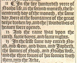
The words “five” and “second” (et al.) in Genesis 7:11 (Illustration 8, below) depict how easily the “f” might be confused with a long “s” (ſ), and vice versa.
Several points are demonstrated in Illustration 8, this snip of Genesis 7:11-13. The pilcrow is used. There are no apostrophes (’) to show possession, as we punctuate modern words. Notice “Noahs life” in verse 11 and “Noahs wife” in verse 13. Verse 13 gives an example of the capital “S” beginning the name “Sem”, as well as the use of the long “s” and short “s” in the word “sonnes”. “Iapheth” shows how the capitalized “I” looks quite like a modern “J” (though it is not).
The letter u
The “u” and “v” are interchangeable letters, according to their placement in a word. When it is the first letter of the word, “v” style is used. When within the word, “u” style is used. “V” is used when the letter is capitalized (See Illustration 2). However, the capital “U” in blackletter appears more like what we modern readers might think of as a “U” rather than “V” (nevertheless, it is one letter).
In some roman type “w” is a double u (that is, two of them side by side, and the “u” usually appears like a “v” – thus “vv”, – vvhen, vvhere, etc.). I do not believe this type printing occurs anywhere in the 1611 King James Bible.
The letter z
In the 1611 blackletter type, the small letter “z” appears somewhat like a cursive “z”, but does not extend well below the line (z). For example, see Uzziah in 2 Kings 15:13, 30, 32, 34.
The letter þ (called thorn)
A “y” (i.e., what appears to be one), when used with a superscript “e” (i.e., above the “y”, yͤ; see Illustration 9.) or in an abbreviation “yt” (yͭ, for “that” as in 2 Cor. 13:7), represents the Old English letter “thorn” (þ). In those cases, the “y” works as a “th” sound rather than “y”. It means “the” (not “ye”) and “that” (not “yet”). The word should not be confused with the second person plural pronoun “ye” (and it is pronounced with a “th” rather than “y” sound). This usage can be found in a number of places, such as in 1 Kings 11:1, Job 1:9, Ezekiel 32:28, John 3:16; 15:1, Romans 15:29, Colossians 1:1, and James 3:12. Illustration 10 shows the abbreviation “yt” (yͭ) for “that”. Other cases of “yͭ” include Jeremiah 49:17; John 12:2; Hebrews 7:21.
1611 Bible symbols
A tilde or macron (~ -) is used in some words as a sort of abbreviation. An “m” or “n” following a vowel may be replaced by placing the tilde or macron over the vowel, as cõfessing in Mark 1:5. This is the equivalent of “confessing,” abbreviated. This usage probably was a printer’s decision, to save space; compare Matthew 3:6 where it is confessing rather than cõfessing. See also Acts 13:30, which shows the omission may also be at the end of a word – “frõ.” “yͤ” abbreviates “the” and “yͭ” abbreviates “that”. In 2 Chronicles 23:21 “wt” abbreviates “with”.
Marginal notes
These two verses in Isaiah 53 in Illustration 12 show three different symbols used to lead to marginal notes: asterisk, cross or dagger, and double bar (*, †, ||). The asterisk (*) denotes a cross reference to a related scripture or scriptures. The cross, or dagger, (†) indicates a more literal translation (prefaced by Heb., Chal., or Gr., followed by a word or words in italics).The double bar (||) points to an alternate reading (|| Or, followed by a word or words in italics).
Miscellaneous
At the bottom right of pages in the 1611 Bible, you will find a “catchword.” A catchword is a word placed at the right-hand foot of the page that anticipates (records or repeats) the first word on the following page. See Illustration 13. This was common in early printed texts up into the 18th century. It probably helped both the printer and the reader to make the connection between the two pages.
While there are no apostrophes of possession, there is at least one place it is used to form a contraction. An apostrophe replaces the “e” in “long wing’d” in Ezekiel 17:3.
Hyphens come in two styles – within words, the single dash “-” (e.g. Iehouah-ijreh, Genesis 22:14; Nebuchad-rezzar, Jeremiah 21:2, 7) versus a double dash “⸗” for a hyphen dividing a normally unhyphenated word at the end of the line of type (see Illustration 6, “accep⸗ted” in Ephesians 1:6).
The conjunction “and” is often abbreviated or brevigraphed (represented) with a form of the Tironian “et” (see examples in Genesis 2:4, 7, 22, 25.)
In Genesis, “LORD” for Jehovah is in all caps (LORD), but in small caps (Lord) in other books of the Bible. Unexpected capitalization sometimes emphasizes or calls attention to a verse or something within it. All roman caps accentuate an inscription, or something written, in Daniel 5:25 (+ vs. 26-28); Matthew 27:37; Mark 15:26; Luke 23:38; John 19:19; Acts 17:23; Revelation 17:5; Revelation 19:16. In addition, I AM THAT I AM in Exodus 3:14 appears in all caps in blackletter type. Exodus 6:3 has IEHOVAH in all roman caps.
In the 1611 Bible, there are no quotation marks (“ ”) for dialogue, quotes, etc. If you use a modern KJV printing, this is the same, not a difference. Some of these typographical or orthographical traits may be seen continuing much later and even in printings in roman type, such as the long “s” and the “i” instead of “j”.
1611 Bible words
Extended discussion of Bible words is too cumbersome to include here. (A little information about thees and yes is here and about verb endings here.) In 1611, English spelling was not standardized to the point is has now developed. Therefore, a number of variant spellings appear throughout the 1611 printing. An “e” word ending that has dropped out of use is a very common trait. Nevertheless, it should be rare that the average reader cannot discern what the word is, despite the variant spelling. The sound of the word is often the same or very similar.
A few examples
- beleeveth = believeth
- crosse = cross
- doe = do
- euery = every
- fortie = forty
- iniquitie = iniquity
- layd = laid
- moneth = month
- onely = only
- owne = own
- riuer = river
- shalbe = shall be
- sonne = son
- warre = war
- windowes = windows
- yerre or yeere = year


No comments:
Post a Comment